

Personalization becomes creepy when the buyer feels watched instead of helped. The difference is usually not a clever line of copy. It is whether the message reflects a useful, obvious context or exposes information the person did not expect you to use.
For a B2B SaaS site, a good personalized experience can be simple: an ad for finance teams lands on a page that speaks to finance-team problems; a returning visitor sees the relevant integration guide; a large account gets an easy route to the right specialist. A bad experience says, “We noticed you spent six minutes reading our pricing page,” before the person has chosen to identify themselves.
You do not need to make the website act like it knows everything. You need to make it easier for the right visitor to find the next useful answer. That requires good judgment, a narrow starting point, and a willingness to leave some data unused.
Personalize Without Crossing the Line
Newmode, now presented under the Algomo name, is built around campaign and account context rather than raw browsing detail, which fits the respectful-personalization approach this guide walks through.
The practical definition of respectful personalization
Respectful personalization uses context that makes the visitor’s job easier. It might be the campaign they clicked, their broad industry, the product area they selected, the account they intentionally logged in from, or a preference they gave you. The experience should feel like a better-organized version of your website, not an unexpected reveal about their private behavior.
There is a simple test I like: if a normal salesperson could reasonably know the context from a public conversation or the visitor’s own choice, it is usually safe territory for a message. If the line depends on hidden tracking detail, a shaky data match, or a personal inference, leave it out. You can still use that data internally to improve timing or prioritization without putting it in front of the visitor.
That distinction keeps personalization useful. It lets marketing and sales work with real signals while avoiding the moment where the buyer thinks, “How exactly do you know that?”
Start with the buyer’s stated context
The safest form of personalization is information the visitor has clearly provided. A selected use case, a form response, a product plan, a location choice, or an account login can all make a page more relevant. The buyer understands why the experience changed because they caused the change.
For example, someone who chooses “sales operations” in a resource library can be shown a relevant case study and an implementation page for that role. Someone who picks an ecommerce use case can see content related to fulfillment and support. None of this requires pretending your company has discovered something secret about them. It is just good site organization.
Use this layer first. It is reliable, easy to explain, and often enough to improve conversion paths. Many teams skip it because it seems less advanced than account-level data. That is backwards. A clear path built around voluntarily shared context will usually beat an elaborate experience based on weak assumptions.
Use account context carefully
Account-based personalization can be useful when a known target company is actively evaluating your product. You might change a landing page headline to speak to that company’s industry, show a relevant customer story, or make it easier to book with the account owner. The point is not to make a dozen dramatic page changes. The point is to remove unnecessary distance between the buyer’s problem and your proof.
Keep the messaging at an account or segment level. “Built for teams managing complex implementation work” is helpful when it aligns with a known industry. “We saw your product manager comparing our integrations at 10:43” is not. The first gives a buyer a relevant path. The second makes the interaction feel like a surveillance report.
Userled describes account-based marketing as work that coordinates personalized activity across channels such as web, ads, email, and sales-led plays. That is a useful framing if you remember that personalized does not mean invasive. Read its account-based marketing examples for the type of coordinated journey this category is trying to support, then build your version with fewer assumptions and clearer boundaries.
Be honest about what the technology is doing
Website-personalization and visitor-identification products may process data such as browser or device information, page views, time on site, clicks, scrolls, navigation paths, and cookies. The exact data and roles depend on the tool, configuration, and legal context. Do not treat the implementation as a small marketing toggle. Review the provider’s documentation and make sure your own privacy information accurately explains your approach.
Newmode’s privacy policy, for example, lists device and browser details, usage data such as pages, clicks, scrolls, and navigation paths, plus cookies and similar technologies. It also explains that customers control information collected on their behalf in many customer-data situations. Read the privacy policy yourself rather than relying on a stale summary.
There is no single privacy answer that fits every business or market. In the UK, the ICO’s direct-marketing guidance emphasizes planning, fair and clear collection, lawful basis, and respecting people’s preferences. If you use these tools, get advice appropriate to your jurisdictions and setup. The ICO guidance is a good starting resource, not a replacement for tailored legal counsel.
Five rules that keep personalization useful
1. Personalize for the job, not for the novelty
Every change should solve a visitor problem. A finance leader should see a finance-relevant proof point because it answers their concern. A prospect coming from an integration campaign should land on the integration information they expected. If a change exists only to prove that your software can swap text on a page, it will usually add noise.
Write the job before you write the copy. “Help a security reviewer find our security documentation” is a job. “Make the page more personalized” is not. The first gives you a clear test: did the right people reach the right material and move forward? The second encourages surface-level changes that do not improve the buyer experience.
2. Keep the surprise level low
A visitor should be able to understand why a page is relevant without feeling exposed. Broad industry language, campaign continuity, and voluntarily shared preferences pass this test. Detailed browsing references, guessed personal circumstances, and overly specific claims do not.
When in doubt, phrase the change as an option rather than a conclusion. “Explore examples for SaaS operations teams” lets the buyer choose whether it applies. “Your operations team is struggling with X” assumes more than you know. The first is helpful. The second can feel presumptuous even if the data happens to be right.
3. Do not let weak data create strong claims
Account matching, intent data, and enrichment can be incomplete or wrong. A company-level match does not prove who is on the page or why they are there. A job title does not prove buying authority. A return visit does not prove urgency. Treat those signals as a reason to inspect context, not an excuse to make a bold personal statement.
This rule also makes your sales follow-up better. A rep who says, “I thought this implementation guide might be useful given the work your team is doing,” has a reasonable opening. A rep who announces that they tracked an individual’s reading path has created friction before the real conversation begins.
4. Give people a clean way to choose
Make it easy to navigate back to general information, change a preference, or reach a human. Personalization should narrow the path without trapping anyone in a segment. If you show an industry-specific page, keep the normal product navigation visible. If an agent starts a conversation, let the visitor decline or choose a different topic.
Choice is not just a legal or design detail. It protects your assumptions. A buyer may work at a healthcare company but be evaluating the product for a retail division. They may arrive through an old campaign that no longer reflects their problem. Good paths leave room for the person to correct the system.
5. Review the experience like a skeptical buyer
Once a week, visit the key paths yourself. Check the message, the claims, the source material behind any agent response, and the handoff. Ask someone outside the campaign team to do the same. People close to a personalization project often stop noticing language that would feel odd to a new visitor.
Look for four warning signs: a claim the visitor did not give you permission to make, a generic block that adds nothing, a recommendation that does not match the page, or a dead end after the visitor shows interest. Fix those before adding more segments or more automation.
New to High-Ticket Dropshipping? Get the Free Beginner Guide →
Good and bad examples
| Situation | Respectful approach | What to avoid |
|---|---|---|
| A paid campaign targets a specific industry | Send the click to a page with a relevant case study and clear use-case language | Claiming you know the visitor’s exact role or internal project |
| A target account returns to pricing | Notify the account owner to review CRM context and choose a useful follow-up | Putting the person’s browsing history into an automated email |
| A visitor asks a product question in chat | Answer from approved source material and offer a human handoff | Letting the agent invent details to keep the conversation moving |
| A logged-in customer revisits documentation | Surface relevant help resources or product guidance | Using the behavior to push an unrelated upgrade offer |
The pattern is simple: use a signal to make the next step more useful, not to show off what you collected. The buyer should feel more supported than monitored.
How to build a respectful first campaign
Choose one audience with a real reason to exist
Pick a group that already receives a specific message from your business. It might be accounts from one paid campaign, visitors researching one integration, or existing prospects with an open evaluation. Do not start with “everyone who visits the website.” That is a recipe for generic content and weak measurement.
Define the problem this audience is trying to solve. Then choose one relevant asset, one next step, and one owner. For example, a campaign for data teams might lead to a short integration page, a technical customer story, and an option to talk with a solutions specialist. That is enough for a real test.
Set the evidence threshold
Decide what data is strong enough to change an experience or create an internal alert. A first visit may only earn a relevant landing page. A repeat visit from a target account to high-intent content may earn a sales task. An explicit form request should earn fast human follow-up. Keep the levels clear so your team does not treat every event as the same thing.
Write these rules down. If two people would make different choices from the same signal, your workflow is too vague. The software will not fix the lack of agreement. It will scale it.
Prepare the content before switching anything on
Personalized content should be useful even if the personalization disappears. That means your industry page needs real examples, your agent needs current answers, and your case study needs to support the promise in the headline. Do not build a page that only works when a data match is perfect.
Remove outdated claims, set clear escalation points, and check that the human who receives a handoff can see enough context to help. A polished opening followed by a confused sales response is worse than a generic page that tells the truth.
Measure trust as well as conversion
Track the normal business measures: qualified conversations, accepted meetings, conversion rate, pipeline movement, and sales feedback. But also look for signs that the experience is creating discomfort. Are people abandoning the chat after a specific opener? Are reps hearing “how did you know that?” Are support teams receiving questions that the agent should have handled?
Trust is not always a tidy dashboard metric, so read actual conversations and ask your team what they are seeing. A slightly lower conversion rate from a more respectful experience can still be a better long-term result than short-term gains that make buyers avoid your brand.
Where a personalization platform fits
A platform such as Newmode, now presented under the Algomo name on newmode.ai, can make sense when your team needs account signals, personalized pages, campaign continuity, and conversational routing to work together. It is most useful after the basic message and ownership rules are in place. If you skip that work, you risk building a sophisticated system that delivers sophisticated confusion.
For an account-based workflow focused on coordinated ads, microsites, and sales context, Userled is another option to evaluate. If the immediate need is simply understanding account-level website activity and responding to it, Warmly may be a more direct starting point. These tools sit in different parts of the same broader process, so compare the job you need done rather than the feature checklist alone.
Bring the same discipline to ecommerce
The ecommerce version of this principle is just as important. A high-ticket store should make it easier for a serious buyer to assess the right product, not hide basic information behind aggressive pop-ups. A focused offer and useful guidance go much further than pretending a shopper is part of a secret segment. This high-ticket dropshipping overview explains the importance of solving a real customer problem.
If your catalog and targeting are too broad, personalization will not save the experience. Start by choosing categories where a buyer has clear needs and questions. This list of high-ticket niches is a practical place to pressure-test that focus.
Then make sure the business can deliver after the customer converts. Review the supplier-selection guide and the business foundation checklist. More practical resources are available on the E-Commerce Paradise homepage.
Want the Store Built and Launched Without the Guesswork?
We handle supplier outreach, the build and the launch, so your hours go into selling rather than configuring software.
If you want a second opinion on where your own personalization is helpful versus invasive, that is a good conversation for EP coaching.
Frequently Asked Questions
What makes website personalization creepy?
It feels creepy when it reveals more about the visitor than they expect you to know, relies on an inaccurate personal assumption, or gives them no obvious reason for the change. Keep the experience tied to useful, understandable context and avoid referencing detailed browsing behavior in customer-facing messages.
Should I personalize by company or individual?
Start with broad segment or account-level context and only use individual information where you have a clear, appropriate reason. Company and industry context are often enough to make a page more useful. Individual-level claims carry more risk of being wrong or making the visitor uncomfortable.
Can I use visitor data for sales outreach?
You need to assess this based on your data, provider, jurisdictions, privacy notices, and applicable rules. Review the relevant guidance and get qualified advice for your situation. From a practical standpoint, use the data to improve timing and relevance, not to expose a person’s browsing activity in the outreach itself.
How many personalized pages should I create first?
Start with one segment and one path. A single useful landing page, a relevant proof point, and a clear human handoff can teach you a lot. Expand only when the first path creates better outcomes without adding confusion or maintenance burden.
Related Articles
If you found this useful, these guides go deeper on related topics:
- 5 Best Website Personalization Tools for B2B SaaS in 2026
- Newmode vs Userled: Which AI ABM Platform Fits Your Go-to-Market?
- Reditus vs Partnero: Which Affiliate Platform Fits B2B SaaS Better?
- Best Simple Website Analytics Tools for Ecommerce
- What Is High-Ticket Dropshipping? A Comprehensive Guide for Ecommerce Entrepreneurs

Trevor Fenner is an ecommerce entrepreneur and the founder of Ecommerce Paradise, a platform focused on helping entrepreneurs build and scale profitable high-ticket ecommerce and dropshipping businesses. With over a decade of hands-on experience, Trevor specializes in high-ticket dropshipping strategy, niche and product selection, supplier recruiting and onboarding, Google & Bing Shopping ads, ecommerce SEO, and systems-driven automation and scaling. Through Ecommerce Paradise, he provides free education via in-depth guides like How to Start High-Ticket Dropshipping, advanced training through the High-Ticket Dropshipping Masterclass, and fully done-for-you turnkey ecommerce services for entrepreneurs who want a faster, more hands-off path to growth. Trevor is known for emphasizing sustainable, real-world ecommerce models over hype-driven tactics, helping store owners build scalable, sellable, and location-independent brands.
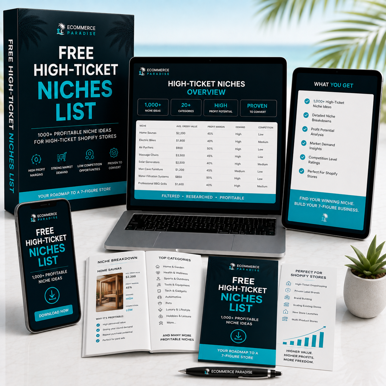
Still deciding what to sell?
Grab the free list of 1,000+ niches that work for high-ticket dropshipping, sorted by category.
Free. Unsubscribe any time.


