


The high-ticket model has one structural weakness that nobody mentions in the courses. You are selling a four-thousand-dollar sauna, a nine-hundred-dollar patio heater or a two-thousand-dollar massage chair, and you have never touched one. Neither has your customer. The entire sale rests on pictures, and the pictures were made by the supplier and handed to every other store selling the same thing.
Open the top five results for any high-ticket product and count how many use the identical hero image. Usually all of them. The buyer notices, even if they could not say what they noticed, and the store that looks like a reseller gets treated like one. Price becomes the only difference, and the race to the bottom starts.
At E-Commerce Paradise, I look at product imagery as a trust problem before I look at it as a design project. On a $3,000 to $5,000 order, a buyer is trying to work out whether the store understands the product and will be there after the sale.
The high-ticket model works when you add a better buying experience around an authorized product, not when you simply copy a manufacturer catalog. The high-ticket dropshipping guide is a good starting point if you want to understand where that value comes from.
Why the supplier’s images are a ceiling, not a floor
Supplier photography is made for the supplier’s purposes. It shows the product accurately enough to be sold, in a generic setting, from the angles the manufacturer thought mattered. It is not made to answer the questions a person spending four thousand dollars is asking.
How big is it really, next to a person? What does the back look like, where the cables come out? What does the finish look like up close, in daylight rather than under studio strobes? How does it look in a room like mine, not a showroom?
A high-ticket buyer spends twenty minutes on a product page and comes back three times. The images have to survive that scrutiny. Most supplier sets are four to six photos and survive about ninety seconds.
That is the part a lot of store owners miss. A manufacturer image set may be technically correct, but it usually does not answer the objections that stop an expensive purchase. It may show the front of a sauna, but not the door clearance, the heater controls, the bench depth, or the cable location your buyer is trying to picture in their own home.
It also does not build a visual identity for your store. The same white-background shot may be fine for a supplier catalog, but a niche store needs to make the product feel considered and specific. That is how you get out of competing on price with forty stores using the same asset.
Before you sign a supplier, ask what assets are included and what you are allowed to modify. The guide to finding the best suppliers can help you build those questions into your supplier process, along with MAP policy, shipping terms, and warranty details.
Get the permission in writing. A supplier may be happy for you to use its existing product images but not happy for you to create new renders using its logo, technical drawings, or proprietary design files. That conversation is much easier before you have paid a studio and built 40 product pages around the asset.
The options when you cannot shoot it yourself
Ask the supplier for more. Worth doing, and occasionally productive. Some manufacturers have a deeper image library than they publish, including lifestyle shots and detail views. Most do not, and the ones that do are sharing it with everyone who asks.
Order one unit and shoot it. For a product you sell twenty of a month, this pays for itself. For a product you sell twice a quarter, it is a two-thousand-dollar photo session, and it does not solve the problem for the eleven color variants you also list.
Have the product rendered. This is what the larger stores in the space have quietly moved to, and it fits the model better than anything else because it removes the need to possess the object. An accurate digital model is built from the manufacturer’s specifications, dimensions and existing photos, and every image is produced from that. Hero shots on a clean background, the product in a room, close-ups of the finish, the back panel, the underside, the thing in use with a person for scale.
The model, once built, keeps paying. New colorways are material swaps. A seasonal campaign is a new scene around the same object. And because the render is yours, it is on no other store.
There is a fourth option that works for some catalogs: combine supplier photography with a small number of custom assets. You might keep the clean cutout as the main listing image, then commission one lifestyle scene, one close-up, and one scale image for the products that pay the bills. That is usually less expensive than treating every SKU like a full creative campaign.
Do not render a product just because rendering sounds cool. Start with products where the supplier assets leave the most questions unanswered, the average order value is high enough to justify the work, and the product has enough demand that you can use the asset in ads, email, organic search, and the product page. Go deep before you go wide.
If you are launching a new niche site, build the imagery budget into the business plan rather than treating it as an emergency expense after launch. The business formation checklist is a good reminder that real operations need a budget, documented supplier permissions, and a plan for the assets you are paying to create.
For the store itself, I still recommend Shopify because it gives you a clean product-page foundation and makes it straightforward to add the visual assets, product information, and conversion tools that matter. The platform will not solve a weak image set for you, but it gives you a much better place to present a strong one.
The format that does the most work on a high-ticket page
Static images sell the first look. What closes the sale on an expensive object is the ability to inspect it, and that is what interactive spins are for.
A 360-degree product spin lets the buyer rotate the product, stop on the side they care about, and zoom into the seam or the control panel or the hinge. It answers the “what does the back look like” question without a support ticket. Stores that add spins to high-ticket pages consistently report longer time on page and fewer pre-sale questions, which for a lean operation is the difference between a manageable inbox and a full-time job.
Spins used to require the physical product on a turntable. Produced from a digital model, they do not, which is precisely why they suit a business that never sees its stock.
The spin is not a replacement for the rest of the image set. Use it after the buyer has a clear main image, a scale image, close-ups of the differentiating features, and at least one lifestyle image. The spin handles inspection. The other images handle context and desire.
A product-page guide from Shopify recommends pairing high-quality product photos with lifestyle imagery, zoomable detail views, and interactive elements that help shoppers understand what they are buying. That matches what I have seen with high-ticket stores: the buyer wants the technical details and the feeling of seeing the item in their own space.
Put the images in the order that helps someone make a decision. Lead with the clearest hero shot. Follow with the room or use case. Then show the size, materials, controls, and less attractive but important sides of the product. A gorgeous front angle is not enough if the buyer needs to know how far the chair reclines or whether the outdoor heater has a visible propane tank.
Think about image speed too. A 20-megabyte gallery may look great in a designer’s preview and still make a mobile buyer wait. Export modern, compressed web files, load the initial images quickly, and test the page on an actual phone connection. A slow product page is a pain in the butt, especially when the buyer is comparing five similar stores at once.
Product images can also support visibility in search when the page data is complete and accurate. Google’s product structured data documentation explains how product markup can make a page eligible to show details such as price, availability, and reviews in search results. The imagery still needs to match the actual item and selected variant, so keep the asset names, alt text, color labels, and product data organized.
What to send the studio when you have never seen the product
The objection from operators is always the same: how can anyone model a product I do not have. The answer is that the supplier has everything needed and will usually hand it over, because better images on your store mean more of their units sold. Ask for the dimensioned drawing or spec sheet, the material and finish list, the highest-resolution photos they have from every side, and if possible the packaging artwork, which often contains views the listing does not. A competent studio can build an accurate model from that set without a physical sample. For anything with an unusual finish, a fabric swatch or a small material sample in the post closes the last gap.
Give the studio the real buyer questions, not just the manufacturer data. If customers ask whether a massage chair fits through a standard doorway, ask for a doorway-scale image. If they ask whether a sauna works in a garage, ask for a garage scene that makes the electrical and ventilation requirements clear. You are creating a sales tool, not a pretty object.
Build a one-page brief for each product family. Include the exact SKU, variant names, dimensions, finishes, reference photos, required angles, prohibited claims, and the destination pages where the final assets will appear. This takes an hour up front and saves you from the painful back-and-forth where a studio delivers six beautiful images of the wrong version.
Accuracy matters more than visual drama. A render that shows a walnut finish too warm, a seat height too low, or a feature that is optional on the actual SKU can create support tickets and returns. Have the supplier approve the technical details before the images go live, then make sure your product-page copy describes only what the buyer will receive.
What this does to returns
High-ticket returns are ruinous. Freight both ways on a two-hundred-pound item can wipe out the margin on three sales. The single biggest cause of returns on large products is the item not matching the buyer’s expectation, and the expectation was set by the images.
Imagery that shows scale honestly, shows the finish in realistic light and shows the parts the supplier hid reduces the gap between expectation and delivery. That is not a marketing benefit. It is a cost line.
Be honest about what the product does not include, too. If the photo shows accessories, installation, a floor mat, or a styled room that does not come with the purchase, say so near the gallery and in the description. High-ticket buyers are usually willing to pay when the offer is clear. What they do not tolerate is feeling surprised after a freight delivery shows up.
Before spending on a full catalog refresh, review your return reasons and pre-sale emails. You may find that three questions create most of the friction. If “Will this fit?” keeps coming up, your first custom image should be a scale shot. If “What color is it really?” keeps coming up, make the next asset a daylight finish close-up.
A practical sequence for a store already running
Start with the five products that carry the most margin. For each, list the questions buyers actually ask in pre-sale messages. Those questions are the shot list. Get those products modeled and produce the images that answer the list, including a spin for anything over a thousand dollars.
Measure the page before and after. Time on page, add-to-cart rate, pre-sale message volume, return rate over the following quarter. If the numbers move, roll it through the catalog in order of margin. If they do not, you have learned that imagery was not the constraint on those products, which is also worth knowing.
Keep the test simple. Choose one product with reliable traffic, record four weeks of baseline data, make the image changes, and let the new version run long enough to collect a meaningful sample. Do not change the copy, price, shipping policy, and images all on the same day, because then you will not know what actually moved the number.
Shopify’s guide to testing product images is useful for building simple experiments around scale, context, detail shots, and visual order. You do not need a massive conversion-rate-optimization program to learn from a product page. You need one clean hypothesis and a way to record the result.
Once you have a winner, make the asset system repeatable. Save a shot-list template, name files by SKU and variant, store approved source files, and document who needs to approve the final output. The goal is not to create a one-off hero page. The goal is to build a process your team can use every time a profitable product enters the catalog.
If you are still deciding which catalog deserves that effort, the high-ticket niches list can help you look for products with margin, buyer intent, and enough room to create a better experience than the average reseller. Some categories are much more visual than others, and that can be an advantage if you are willing to do the work.
The larger point
High-ticket dropshipping works because the operator adds something the supplier does not: a better buying experience. For a long time that meant better copy, better support and a cleaner site. The images were the one part everyone left to the manufacturer. They are the part the buyer looks at longest. Owning them is the most direct way to stop looking like everyone else selling the same box.
You do not have to begin with an enormous catalog-wide creative project. Start with the products that make you the most money, answer the questions that block the sale, and build a repeatable system from there. That is how you turn imagery from a line item into an asset that keeps helping you sell.
If you want help turning that system into a real store operation, our management service can help with product pages, customer experience, and the ongoing work of scaling without letting details slip through the cracks. For more hands-on direction as you build, the coaching program is there too.
I wish you guys the best of luck out there. Build the store that gives a buyer a reason to trust you, and you will not have to win every sale by being the cheapest option.

Trevor Fenner is an ecommerce entrepreneur and the founder of Ecommerce Paradise, a platform focused on helping entrepreneurs build and scale profitable high-ticket ecommerce and dropshipping businesses. With over a decade of hands-on experience, Trevor specializes in high-ticket dropshipping strategy, niche and product selection, supplier recruiting and onboarding, Google & Bing Shopping ads, ecommerce SEO, and systems-driven automation and scaling. Through Ecommerce Paradise, he provides free education via in-depth guides like How to Start High-Ticket Dropshipping, advanced training through the High-Ticket Dropshipping Masterclass, and fully done-for-you turnkey ecommerce services for entrepreneurs who want a faster, more hands-off path to growth. Trevor is known for emphasizing sustainable, real-world ecommerce models over hype-driven tactics, helping store owners build scalable, sellable, and location-independent brands.
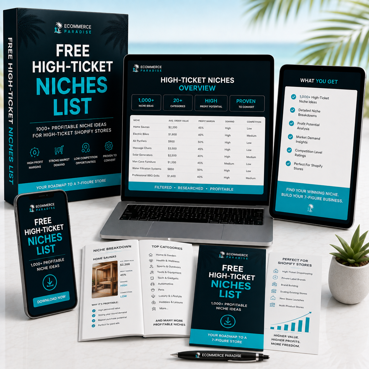
Still deciding what to sell?
Grab the free list of 1,000+ niches that work for high-ticket dropshipping, sorted by category.
Free. Unsubscribe any time.


